

The blue I am loving, so much so I kind of wish I was doing Ultramarines. Obviously I couldn't stand the ridicule so that was never going to happen but highlighting my Bahama Blue Craft Acrylic with Turquoise has brought out some really nice highlights. It also ties in the Verdigris...

... which went a bit OTT. In fact it's pretty much made any detail on the bronze pieces indistinguishable. I'm not sure it works and I'm not sure how to fix it.

The other leg is the same and I'm thinking the paint is already a bit too thick to be adding any more.

The shoulder has even more Verdigris on it but the pattern manages to show through redardless. With hindsight I can see I was much more sparing with the Turquoise on my Tactical squad. i rushed this a bit, added some thinned down Dark Angel green first, then the Turquoise so there was altogether too much going on. I also wanted his sword to be turquoise, to try and tie everything together. It's going to get a couple of coats of gloss varnish too to make it stand out.

Ultimately though I can't see me using him too much once my Azrael is finished so it may be worrying for nothing. Note I went all blue, not Dark Angel green shoulder pad. It's already quite busy so I didn't want to add another colour in. I'm not convinced about the red piping on the cloak. I just don't get how other people are able to get so much detail out of it.
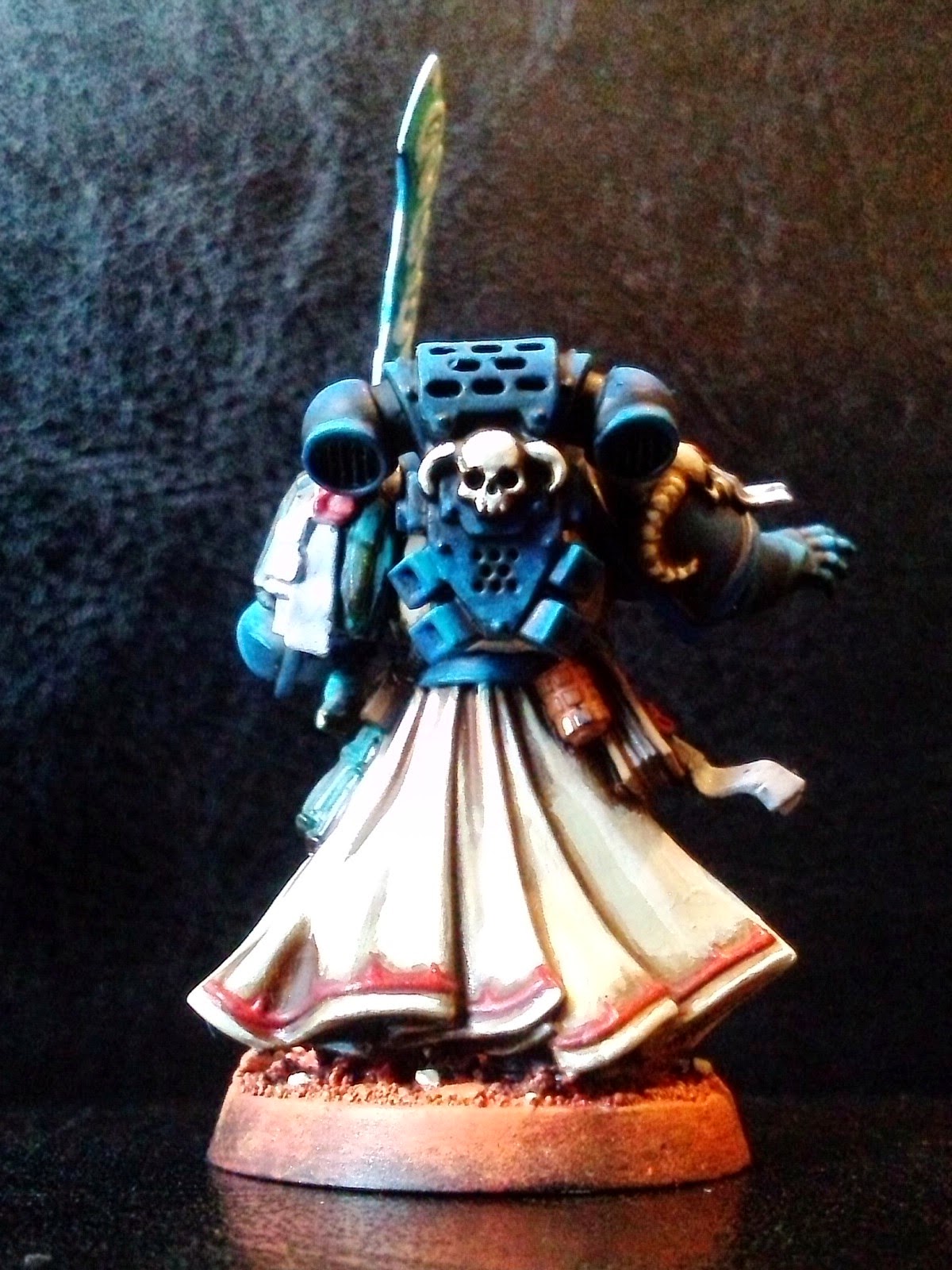

His Chapter symbol also pretty ropey. I'm not happy about this at all. My local GW manager suggested resculpting it as Maximus armour.

Still some highlights to do but it's very close to being complete. Some better pictures may help clarify my concerns. Like I say I'm not completely happy there are some bits I love and some bits that I think are well below the standard of what the model should be,
Looking good. I think the photography is hurting our enjoyment of your work here though. It's a bit washed out. Maybe use a spotlight to reflect off some white paper on the front to add some diffuse lighting. (I've used paper towels over spotlights in the fast to get some decent bounce lighting).
ReplyDeleteThanks Gregg, I agree they're not always the best pics. I use my camera phone and I see a lot of people apologise for that, mainly iPhone users ;) I use a camer app that helps emhance dark light photography so perhaps that's what's washing them out.
DeleteI realised quite a while back that I had to compromise on the photography. Setting up spotlights, even just an angle-poise was meaning I'd just not take the picture. All my shots used to be on my Ferron Proxima background, it also stood out really well on blog rolls. But arranging everything just became a chore.
What I tend to do now is just take WiPs shots as and when I can, otherwise I wouldn't even have any content until the 'to done' post. I try to make the pics as clear as possible given the 12 enhancement options, even so sometimes they're not perfect by any means, the macro shots in particular.
Then when the finished article is complete I put a bit more effort into the photography so you can hopefully get all the detail lost in the WiP shots. I'll do a photoshoot of this guy and the rest of the Dark Angels soon.
Makes perfect sense! I understand completely. I tend to do the same type of thing...take WIP shots differently from the final shots, as moving models around to different areas just wastes time you could be spending painting and building!
DeleteI think we're getting to the point where if you collect Ultramarines, you've actually gone full circle and you're practically a wargaming hipster.
ReplyDeleteYou could try dry brushing bronze back over the detail, followed by highlights (if you can be bothered). That should pick out some more of the raised detail. I'm about to tackle this mini myself, thanks for sharing!
ReplyDelete